A health report redesign project where I conducted usability testing and A/B testing to find the best way to present mental wellness data so that users of all health literacy levels could understand and act on their results.
Timeline
6 months
Company
Whole Communities Whole Health
Role
UX Research & Design

Background
WCWH is a 5-year study collecting health and environmental data from underrepresented families in eastern Travis County. The goal was to empower these families by returning their data through an app, but I quickly realized a major flaw: the data was there, but it was just too confusing for them to understand.
The Problem
General users across different health literacy levels struggle to understand their mental wellness results in the report
83% of users left more confused than when they started.
The report was text-heavy and mentally exhausting to read.
Results were buried with no visual hierarchy.
There were no benchmarks; users saw a number but had no idea if it was good or bad. Especially for the mental health section, since the scores have no standard reference ranges.

#what the original report looks like
Project Goals
Users can navigate through the report and interpret their results without external guidance
Users feel comfortable using the resources provided to take action based on their results
Users finish reading the report feeling informed rather than overwhelmed
Research
I started with usability testing with 7 participants. Task completion rate without guidance was 24%. With guidance, it jumped to 87%. Showing that the users just couldn't access it on their own.
A/B Testing to test what actually works for mental health data
With the insights clear, I needed to figure out a format that was simple enough for users to understand without misrepresenting data.
Solution 1 — Make the comparison immediate. A box plot showing the range of scores for most WCWH participants, with the user's own score highlighted so they could immediately see where they stood.
Solution 2 — Say less, be direct. Just show the score as a number upfront. Simple. The box plot cleared the benchmark. 8 out of 11 users understood their results, but the direct score didn't give users enough context to make sense of what they were seeing.

Before my A/B test, I also made sure that the data presentation makes sense to the psychology data researcher. I also set benchmarks before testing began: whichever design helped at least 6 out of 11 users correctly interpret their results would move forward.

But the work wasn't done. Even with the box plot, 27% of users still needed guidance navigating the full report. So I kept iterating, adding an example graph at the top of the section so users could learn how to read the chart before seeing their own data, and restructuring the layout so results led, and explanations followed.

Design Decisions
Mental Health Section Design
Putting the final iterated box graph design from our A/B testing and with the example graph, the final mental health section brought everything together as a system.

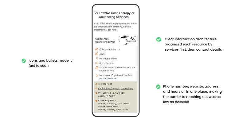
Resource Section Design
Besides the Mental Health Section, I also made iterations for the resource section. The goal was to make it as easy as possible to take the next step.
Impact
20% to 60% comprehension rise in three design cycles
The box plot cleared the UX benchmark. The example graph reduced the interpretation anxiety that was visible in early sessions.
Every change in the final design traced back to something a user showed me in a session or a constraint the psychology team surfaced in a working meeting. Nothing was a guess.
Clear foundation for every report section that came after
Establishing the design system gave the team a clear foundation for every report section that came after. Every change in the final design traced back to something a user showed me in a session or a constraint the psychology team surfaced in a working meeting. Nothing was a guess.
What I Learned
Bring in other perspectives before you design, not after.
Working with the psychology researchers early meant we caught conflicts between user needs and data requirements at the ideas stage, not after we'd already built something. That saved cycles and built trust across the team.
Define success before you test.
Setting the benchmark before the A/B test removed subjectivity from the recommendation. It's the difference between "I think this worked" and "here's the evidence we all agreed on."
Case Study Presentation
View my case study presentation here: https://drive.google.com/file/d/1UqYZhL23paanIpGoFxfkSzuony32iCQ0/view?usp=sharing